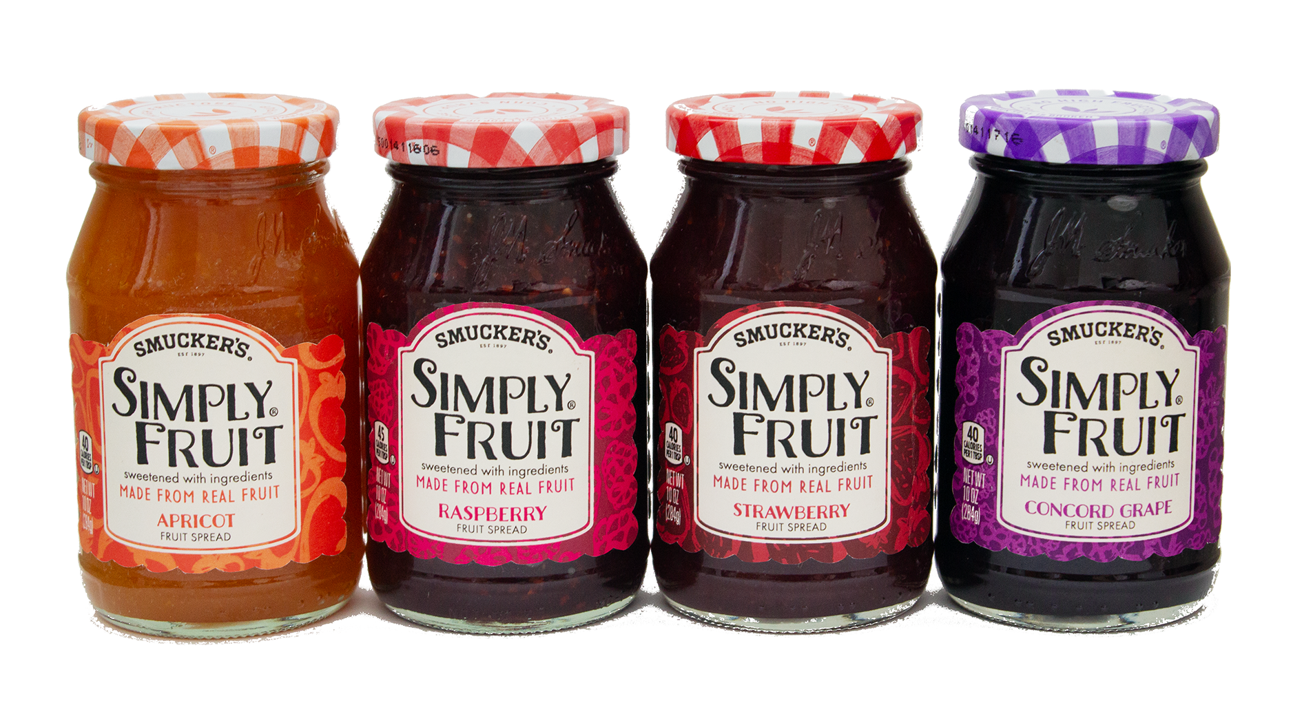
The objective was to create a visually appealing packaging series for Smuckers’ Simply Fruit,
merging vintage and contemporary elements. The incorporation of illustrative fruits, an appropriate use
of typography, and a thoughtfully chosen color palette all contribute to conveying the brand’s natural and
healthy image while maintaining a touch of nostalgia.